Linear regressions model a relationship between dependent and independent statistical data variables. In simpler terms, they highlight a trend between two table columns on a spreadsheet. For example, if you set up an Excel spreadsheet table with a month x column and recorded a set of data for each of the months in the adjacent y column, linear regression will highlight the trend between the x and y variables by adding trendlines to table graphs. This is how you can add linear regression to Excel graphs.

Adding a Linear Regression Trendline to Graph
- First, open a blank Excel spreadsheet, select cell D3 and enter ‘Month’ as the column heading, which will be the x variable.
- Then click cell E3 and input ‘Y Value’ as the y variable column heading. This is basically a table with a recorded series of data values for the months Jan-May.
- Enter the months in cells D4 to D8 and data values for them in cells E4 to E8 as shown in the snapshot directly below.

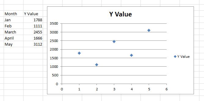
Now you can set up a scatter graph for that table.
- Select all the cells in the table with the cursor.
- Click the Insert tab and select Scatter > Scatter with only Markers to add the graph to the spreadsheet as below. Alternatively, you can press the Alt + F1 hotkey to insert a bar graph.
- Then you should right-click the chart and select Change Chart Type > X Y (Scatter) > Scatter with only Markers.
Next, you can add the trend line to the scatter plot
- Select one of the data points on the scatter plot and right-click to open the context menu, which includes an Add Trendline option.
- Select Add Trendline to open the window shown in the snapshot directly below. That window has five tabs that include various formatting options for linear regression trendlines.

3. Click Trendline Options and select a regression type from there. You can select Exponential, Linear, Logarithmic, Moving Average, Power and Polynomial regression type options from there.
4. Select Linear and click Close to add that trendline to the graph as shown directly below.

The liner regression trendline in the graph above highlights that there’s a general upward relationship between the x and y variables despite a few drops on the chart. Note that the linear regression trendline does not overlap any of the data points on the chart, so it’s not the same as your average line graph that connects each point.
Formatting the Linear Regression Trendline
Formatting the linear regression trendline is an important tool in creating legible, clear graphs in excel.
- To start formatting the trendline, you should right-click it and select Format Trendline.
- That will open the Format Trendline window again from which you can click Line Color.
- Select Solid line and click the Color box to open a palette from which you can choose an alternative color for the trendline.
- To customize the line style, click the Line Style tab. Then you can adjust the arrow width and configure the arrow settings.
- Press the Arrow settings buttons to add arrows to the line.

You can also add effects to your trendline for aesthetic purposes
- Add a glow effect to the trendline by clicking Glow and Soft Edges. That will open the tab below from which you can add glow by clicking the Presets button.
- Then select a glow variation to choose an effect. Click Color to select alternative colors for the effect, and you can drag the Size and Transparency bars to further configure the trendline glow.

Forecasting Values with Linear Regression
Once you’ve formatted the trendline, you can also forecast future values with it. For example, let’s suppose you need to forecast a data value three months after May for August, which isn’t included on our table.
- click Trendline Options and enter ‘3’ in the Forward text box.
- The linear regression trendline highlights that August’s value will probably be just above 3,500 as shown below.

Each linear regression trendline has its own equation and r square value that you can add to the chart.
- Click the Display Equation on chart check box to add the equation to the graph. That equation includes a slope and intercept value.
- To add the r square value to the graph, click the Display R-squared value on chart check box. That adds r squared to the graph just below the equation as in the snapshot below.
- Drag the equation and correlation box to alter its position on the scatter plot.

The Linear Regression Functions
Excel also includes linear regression functions that you can find the slope, intercept and r square values with for y and x data arrays.
- Select a spreadsheet cell to add one of those functions to, and then press the Insert Function button. The linear regression functions are statistical, so select Statistical from the category drop-down menu.
- Then you can select RSQ, SLOPE or INTERCEPT to open their Function windows as below.

The RSQ, SLOPE and INTERCEPT windows are pretty much the same. They include Known_y’s and Known_x’s boxes you can select to add the y and x variable values to from your table. Note that the cells must include numbers only, so replace months in the table with corresponding figures such as 1 for Jan, 2 for Feb, etc. Click OK to close the window and add the function to the spreadsheet.

So now you can spruce up your Excel spreadsheet graphs with linear regression trendlines. They will highlight the general trends for graphs’ data points, and with the regression equations they’re also handy forecasting tools.
Have any tips, tricks, or questions related to linear regression trendlines in Excel? Let us know in the comment section below.
Related Posts
 How To Use Graphs in CapCut
 How to Change the X-Axis in Excel
 How to Quickly Remove Duplicates in Excel
 How To Manage and Move Decimal Places in Excel
 How To Password Protect in Microsoft Excel
 How to Calculate Days Between Two Dates in Excel
 How To Convert Word to Excel
 How To Rearrange Columns in Excel
Disclaimer: Some pages on this site may include an affiliate link. This does not effect our editorial in any way.


