

How To View a Heat Map with Google Analytics

Google Analytics is, without a doubt, one of the most helpful tools for analyzing site performance. It’s been around since November 2005 and has helped countless businesses monitor and improve their performance.
With the help of Google Analytics, you can track a multitude of important statistics such as visitor demographic, traffic channels, unique traffic, total traffic, how long the visitors stay on the site, and others.
Google Analytics will show you the numbers, but sometimes the raw numbers won’t cut it. You may need a heatmap to gain a deeper insight into your site’s performance. In this article, we’ll show you two different ways to get/view heatmaps with Google Analytics.
Page Analytics
Page Analytics is Google’s own add-on for Chrome which allows you to visually track your site’s statistics. While not as potent as GA, Page Analytics offers some pretty handy information. For example, you can inspect every link on a page and get detailed info on the number of clicks. Here’s how to install and use it:
1. Go to the Chrome Web Store and install the Page Analytics add-on.
2. Once the app is added to Chrome, you should see an icon in the upper-right corner. It should be set to “Off”.
3. When you go to a page which you control, activate the app (it should switch to “On”). The app can’t be activated on a site or page you don’t have control over. Also, you won’t be able to activate it if you’re logged into multiple Google accounts.
![]()
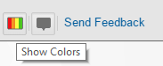
4. Click the app icon and click the “Show Colors” button. The app will then show the page’s data in the form of a heatmap.
Page Analytics is a great option if you want to get a quick insight into how the links on a particular page are performing. The app will show the number of clicks on each link and the percentage of all clicks that they get. The links with the lowest number/percentage of clicks will be green, while the ones with the most clicks will be red.
You will also be able to quickly determine which sections of each page receive the most attention from the visitors and know where to place the most important links and calls to action.
On the downside, if your page has two or more identical links, this app will not be able to distinguish between them.
Build a Heatmap
If you, for example, wanted to track your site’s performance by the hour or day, then you should make a classic heatmap. Here’s a quick and easy-to-follow guide:
1. First, you should log into Google Analytics.
2. Once logged in, click “Customization” and then “New Custom Report”.
3. The dimensions should be “Day of the Week” and “Hour”.
4. The metrics are “Sessions” and “Goal Completions”.
5. Pick the time range. Usually, the longer time range will give you more accurate data, but in this guide a period of seven days will be used.
6. Then, select how many rows you want the report to show. Make sure to extract them all.
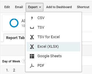
7. Next, export the report to the .xlsx format in order to be able to create your heatmap in Excel. Note that this guide will only cover the “Sessions” by the day and hour table.
8. Once you open Excel, make sure that the hour and day columns are set as numbers.
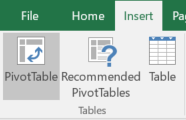
9. Select the table in its entirety, click “Insert” and then “Add Pivot Table”.
10. Click OK when the popup window opens.
11. The Pivot table will appear empty in the new sheet.
12. Next, place “Day of the Week” in the columns segment and “Hours of Day” in rows.
13. The value segment should house “Sessions” item.
14. Optionally, you can copy the new table to a brand new sheet before you add color.
15. To add color, select the value sections. Leave the days and hours out.
16. Click on “Conditional Formatting” and select a color scale. For the purposes of this guide, a red/green scheme will be chosen. Poor performance fields will be in red, while the green will denote high performance.
17. This step is optional. You can, for example, include the total column and row. This way, you’ll get an even deeper insight into which days and hours perform the best.
This simple and clear heatmap made in Excel can help you monitor your site’s performance more easily and with more accuracy, making it a great addition to the classic Google Analytics reports and metrics.
Conclusion
Heatmaps offer a quick and easy way to get an in-depth view of your site’s performance. They are easy to make and simple to read and analyze, which makes them an indispensable item in every business owner’s and marketer’s toolbox. Now that you know how to make and read heatmaps, you’ll have a better understanding of your site’s performance.