


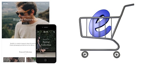
Is Shopify Mobile Friendly?

Creating an online business is no small task. There’s so much to consider. Even when using an almost fully automated eCommerce platform like Shopify.
One of the details to pay attention to is whether your website is going to be mobile-friendly or mobile responsive. As most of us browse through websites on our mobile devices nowadays.
But even if that isn’t the case, the switch from a computer browser to your smartphone should be effortless. After all, those are the demands of the market. But how mobile friendly is Shopify exactly?
Shopify Mobile Responsive Themes
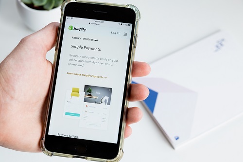
What does it mean for a website to be mobile friendly? Well, it means exactly what it implies. You can load the website on your mobile device. When it comes to Shopify, customers can access products, cart, and checkout pages without a hitch.
Essentially, browsing with your mobile device should be as simple as it is on your computer. If you’re new to Shopify, you should know that you begin building your store by choosing a theme. That’s step one.
And that’s where the question of whether Shopify is mobile responsive becomes important. As of now, most Shopify themes are mobile-friendly. But not all of them. Even those that have various degrees of responsiveness.
If you want to ensure that your customers can browse through your store on their mobiles, you have to pick the right theme. In this respect, Shopify has free themes. But if you want to optimize your page and make more sales, you’ll probably have to go with a paid theme.
Fortunately, the Shopify themes that are mobile responsive will give you a preview of what your website is going to look like on a mobile device. This will help you make a decision that fits with what you envision for your store.
How to Pick a Mobile-Friendly Shopify Theme
Selecting a Shopify theme that complements your brand and the type of products you’re selling is crucial when starting an online store. If it will help the search, Shopify allows you to browse themes by industry, but most are created to fit almost any type of website.
However, if you want to ensure that you select the best possible mobile-friendly theme, there are things to take into consideration. Above all else, the theme should be user-friendly and quick to load on a mobile device.
Then you might want to consider a clean and more minimalistic design. Too many items and colors on a small screen can distract a customer. It’s also preferable that the theme doesn’t look any different, regardless of the device you’re using.
Some Shopify mobile-friendly themes still look quite different when opened on a smartphone. Most importantly, your customers should have an easy time finagling the purchase on their mobile device.
Importance of Mobile-Friendly Shopify Themes
Mobile traffic makes for about half of Shopify’s visits. So, if you choose a theme that will lead customers to finish up their shopping quickly and without any problems, you’re likely to boost your sales.
But more than half of Shopify carts are abandoned. It sounds like a lot, but it’s not really. That’s because most Shopify store owners are using free themes that are not mobile responsive.
Mobile-Friendly Shopify Themes
Many fantastic Shopify themes also look really good on mobile devices. Here are a few that you can search for when opening your online store.
Supply – This theme is excellent for stores that have huge inventories. Categories are organized well, and the navigation is user-friendly on the computer as well as the mobile device.
Minimal – A minimalistic style store with a trendy touch. It’s mobile responsive and looks amazing on mobile devices. And you have a lot of customization options.
Showcase – A great choice for those who want to open online clothing or jewelry stores. It has multi-level menus and a full screen option for galleries.
Picking the Right Responsive Shopify Theme
If your target customer is a person always on the go, then you must have the best mobile-friendly theme. Best meaning that your page is easy to load, easy to navigate, and looks great.
But also, that represents your brand and offers no confusion about what you’re trying to sell. Of course, that doesn’t mean that what your page looks like on a PC doesn’t matter. That’s just one half of the equation.
Do you shop on your mobile device or computer more often? Let us know in the comments section below.
How to Upload Images to Shopify
Read Next
