


What Was Tim Cook Trying to Prove With This Meaningless Chart?
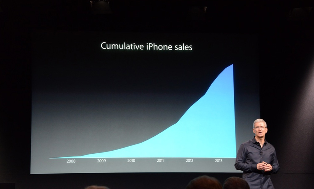
Apple’s iPhone event on Tuesday featured a few very impressive-looking charts. Two of them displayed the dramatic increase in processor and graphics performance between the very first iPhone in 2007 and the upcoming iPhone 5s, but a far more controversial chart displayed “cumulative iPhone sales” since 2007.
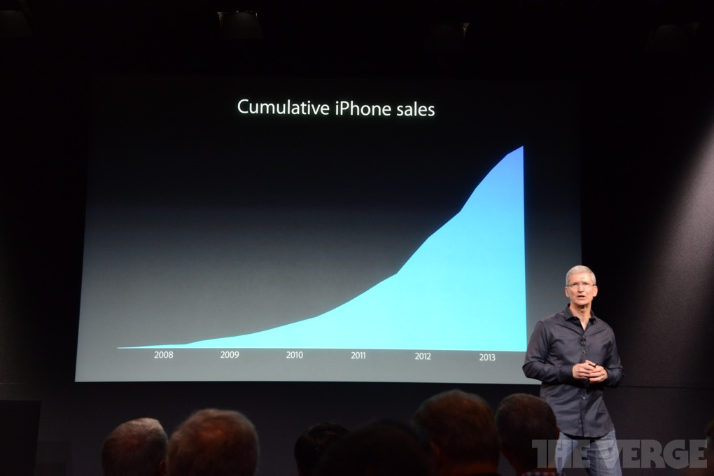
We were immediately skeptical of the data; the chart conveniently omitted any y-axis scale, and the curve for any product would increase over time in a “cumulative sales” analysis. At worst, it would simply plateau.
Quartz had the same impression, and created a custom overlay showing actual data from Apple’s quarterly SEC filings. When juxtaposed with raw numbers it becomes clear, as Quartz puts it, that “at best the chart is misleading; at worst it’s disingenuous.”
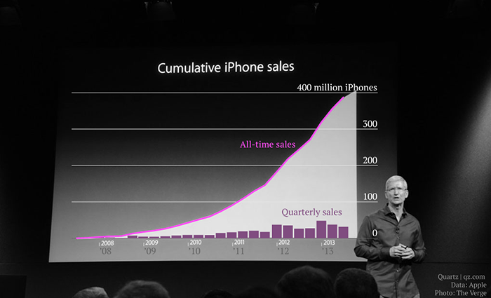
The data still shows an impressive result for Apple: about 400 million iPhones sold in total since the product line’s introduction. But the whole picture is far less positive. As we all know, iPhone sales have declined over the last three quarters and, if the slight drop in the slope at the tip of the chart is reflective of actual sales, Apple will again reveal another decline during its fourth fiscal quarter report at the end of October.
Another issue with the chart is that it hides important realities about Apple’s customer base and the number of iPhones still in use. There’s no question that Apple CEO Tim Cook wanted to present an impression that the company’s iPhone is “on the rise,” both in terms of hardware sales and customers. While the company is adding likely millions of new customers every month, the chart hides the fact that many of those cumulative iPhone sales went to existing customers who either upgraded to a new model or replaced an existing model due to loss or damage.
Related to upgrades and replacements, the chart also hides the fact that many millions of units are no longer in service, having been sent to landfills or otherwise destroyed.
Still, a sale is a sale from Apple’s perspective, even if the phone is now in pieces. But it begs the question of why the company chose to visualize the data with this questionable chart. Surely a big “400 million,” dropped into the middle of the screen using one of Keynote’s fancy transition effects would have sufficed.
There’s a lot to be excited about when it comes to Apple’s new products, but the company also faces serious challenges. Wall Street wasn’t impressed with the company’s presentation overall, and customers are going to buy hardware they find exciting, regardless of the sales numbers. So why waste time with misleading charts?
Original photograph via The Verge; overlay data via Quartz.


2 thoughts on “What Was Tim Cook Trying to Prove With This Meaningless Chart?”