

How To Add and Build Graphs in Google Sheets
Google Sheets is an excellent alternative to Microsoft Excel and can perform many tasks of its more expensive competitor. One thing it does very well is allow you to display data in graphic form, i.e. build graphs. Here’s a quick tutorial on how build graphs in Google Sheets.
Graphs are the saving grace of spreadsheets as far as I’m concerned. Most people like a good graph. They make understanding data simple and breaks the monotony of numerical data with a little bit of color and graphical loveliness. If you use Sheets a lot, making graphs is something you’re going to want to master.
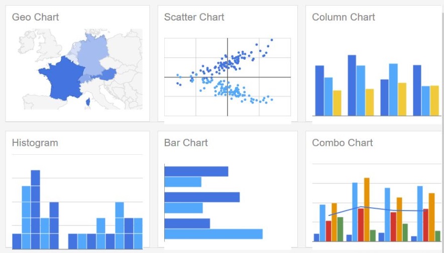
There are a selection of graph types and it will be up to you to choose the most suitable. Some work best with certain types of data while others are more flexible. You can choose from a wide range of types from scatter charts to pie charts, map charts to line charts. There are currently 18 chart types available to use. Visit the Google Sheets chart type page to see them all.
Build the dataset
Before you add a graph to Google Sheets, you need to have all the data in place. You can add or modify data once the graph has been built but it is easier to manage things if it’s all in place first.
- Open your Google Sheet.

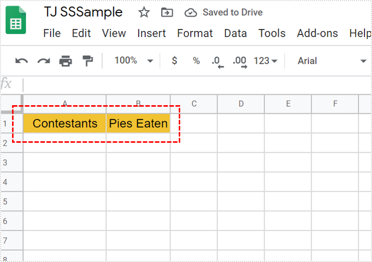
- Add headers to each column or row. These will act as the legend in the graph.

- Add the data to the sheet in any order you like.

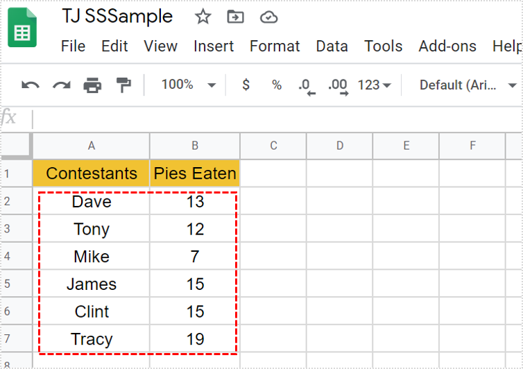
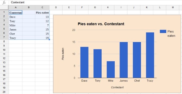
Data should be ordered so all data is uniform. In the example, all the names are in one columns while the results are in a different column. The graph needs this kind of order to be able to make sense of the data.

Building a graph in Google Sheets
Once you have the data in place, building a graph, or chart as Google calls them, is quite straightforward.
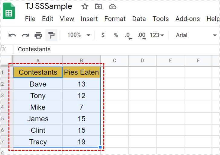
- Drag the cursor over all of the data you want to illustrate in a graph.

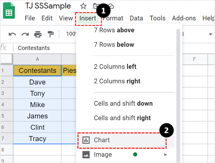
- Select Insert from the top menu, then Chart.

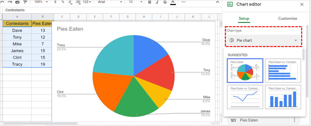
- Select the chart type from the popup box. You can use the suggestion or choose your own, it is entirely up to you.

- Format the graph as you like with the Customization tab.

You will notice while in the graph build window that not all graphs will be selectable. As mentioned above, not all graph types will work in all situations. For example, bar charts and line charts are useful for measuring amounts or counts. Pie charts are only good for measuring divisions of 100%, stepped area charts are purely numeric and so on.
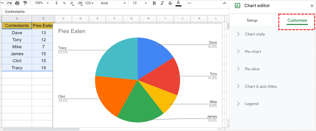
Customizing a graph in Google Sheets
As well as customizing the graph during creation you can also customize it after the fact. This is useful if you suddenly get new data or need to change the styling or type of graph.
- Highlight your graph and right click an empty area of it.
- Select Advanced edit from the menu.
- Select the Customization tab and make your changes.
Advanced edit brings up the same window as when you were creating your graph and allows all the same functions. Here you can change the graph type, colors, fonts, background and just about every element of the graph.
You don’t have to use Advanced edit to make smaller changes if you don’t want to. The right click context menu allows you to change the chart type, area, title, legend, axis and series with one click. I still find it easier to use the customization menu though. Your mileage may vary but at least you have the option.
Using a graph in Google Docs
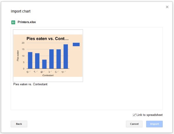
Once you create your graph, you might need to feature it in a presentation or document. Fortunately, it’s quite straightforward to copy the graph from Google Sheets and import it into Docs.
- Open the Google Doc you want to add the sheet to and select an empty space.
- Select Insert and Chart.
- Select From Sheets, then select the chart in the new window and click Select.
- Click on the chart and select Import. Uncheck the box next to Link to spreadsheet if you want the chart to stand alone.
The chart should now appear in your document and you can move, resize or whatever you need to do with it.
There is a lot you can do with graphs in Google Sheets. It’s one of the best ways of working with data as far as I’m concerned.