

How to Change the Legend Name in Google Sheets

If you use charts in your Google Sheets document, it’s difficult to imagine them without a legend. A legend is there to label each section of the chart, to make it clear and understandable at all times.
Google Sheets offers various ways to customize the chart – adjusting the legend is one of them. Besides changing the position, font, and size of the labels, you should also know how to change the legend name.
This article will explain, step-by-step, how to make, customize, and change the name of your Google Sheets legend.
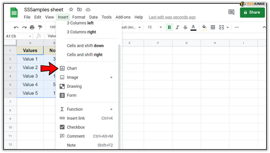
Step 1: Insert the Chart
Since you can’t have a legend without a chart, let’s see how to add one in your Google Sheets document. The process is relatively easy – just follow these steps:
- Open your Google Sheets document.

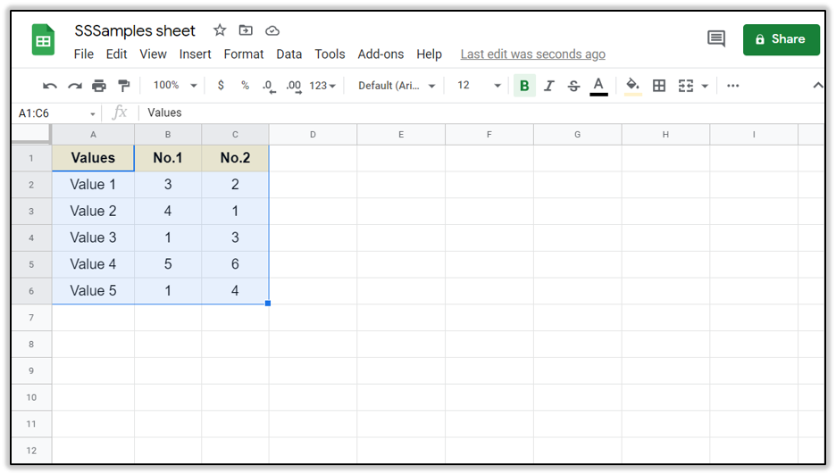
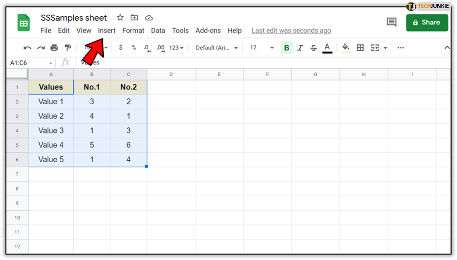
- Click and drag your mouse over all the rows and columns that you want to include in the chart.

- Select ‘Insert’ at the top bar.

- Click ‘Chart.’
Now the chart should appear on your Google Docs.
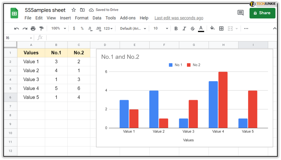
By default, the legend will appear at the top of the chart with the theme default options. Usually, that font is Arial, size 12, with black font color. However, you can further change all these options in the ‘Customize’ box.
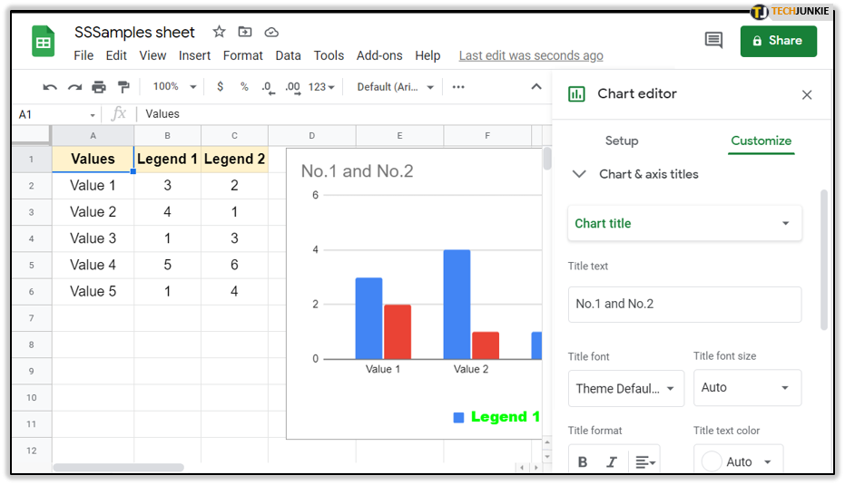
Step 2: Customize Your Legend
Before you rename the legend, you should adjust its other options. To do so, you need to find the ‘Customize’ box. Here’s how:
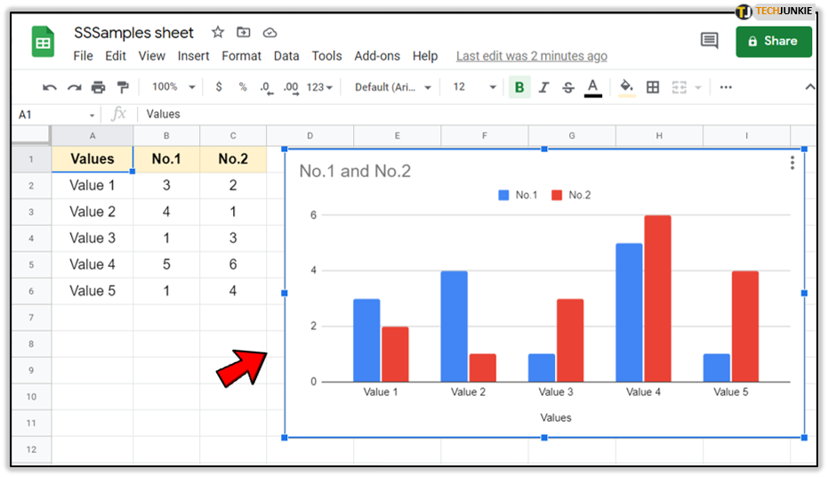
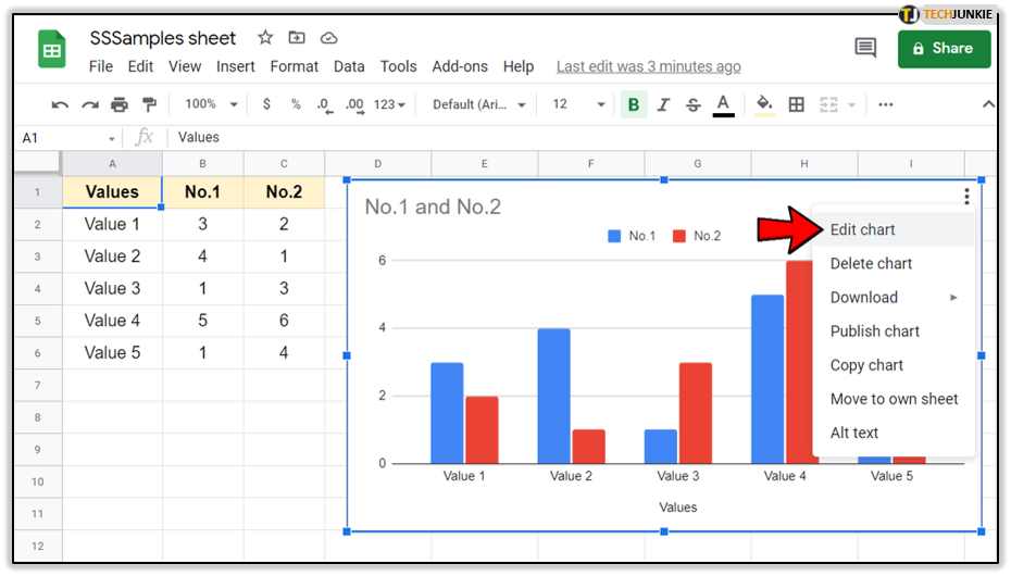
- Click on your chart. If you’re using a smartphone, just tap it.

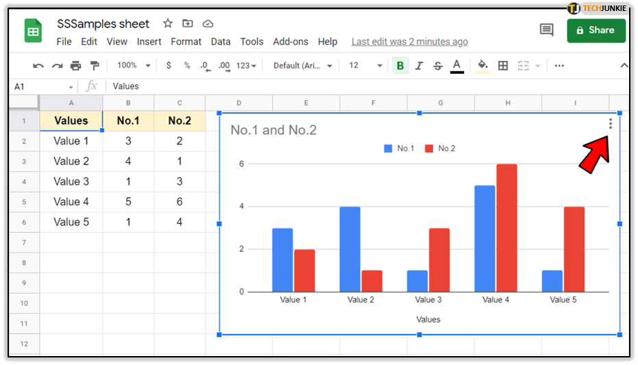
- Select the ‘More’ options on the top-right of the chart (three vertical dots).

- Go to ‘Edit chart.’ A new dialog box will appear. On your computer, you simply double-click on the chart to open the box.

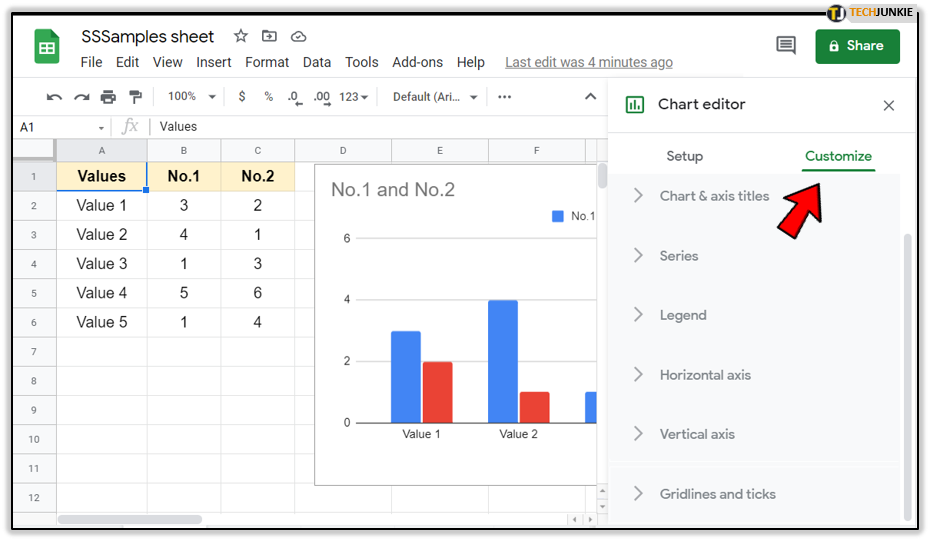
- Select the ‘Customize’ tab.

- Go to ‘Legend.’ This will reveal several adjustable options.

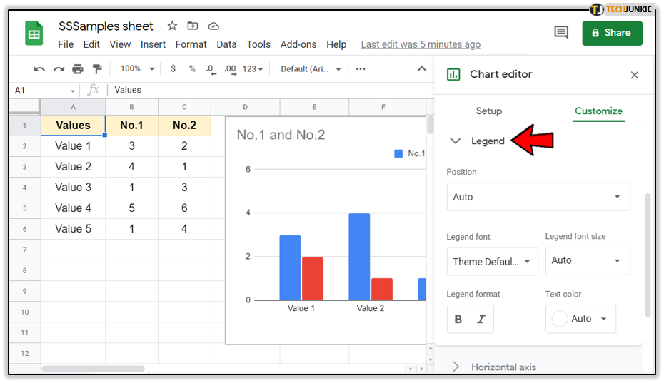
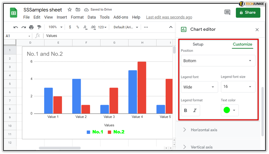
The position section allows you to move your legend around the chart. The default position is the top of the chart, but you can also place it at the bottom, inside the chart, or on either side.
There’s also an option to change the font of the legend with over ten different styles, as well as the font size. If necessary, you can use the ‘Legend format’ option to bold the font or use italics.
Finally, the text color section allows you to change the color of the font. This way, you can adjust the color of the chart border and the colors of the axis with the inner text.
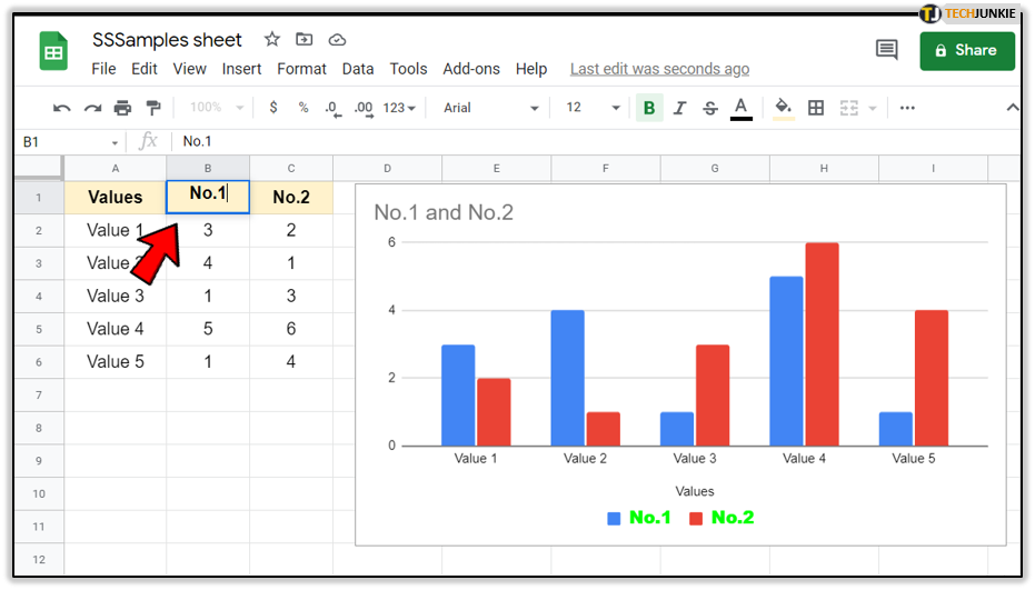
Step 3: Changing the Legend Name
Finally, you can change/rename the labels in the legend. Unfortunately, there’s no way to rename the legend inside the ‘Customize’ box itself. You can only do so by changing values on your spreadsheet. This essentially means that you have to edit your columns if you want the chart values to change.
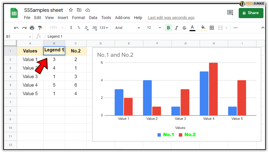
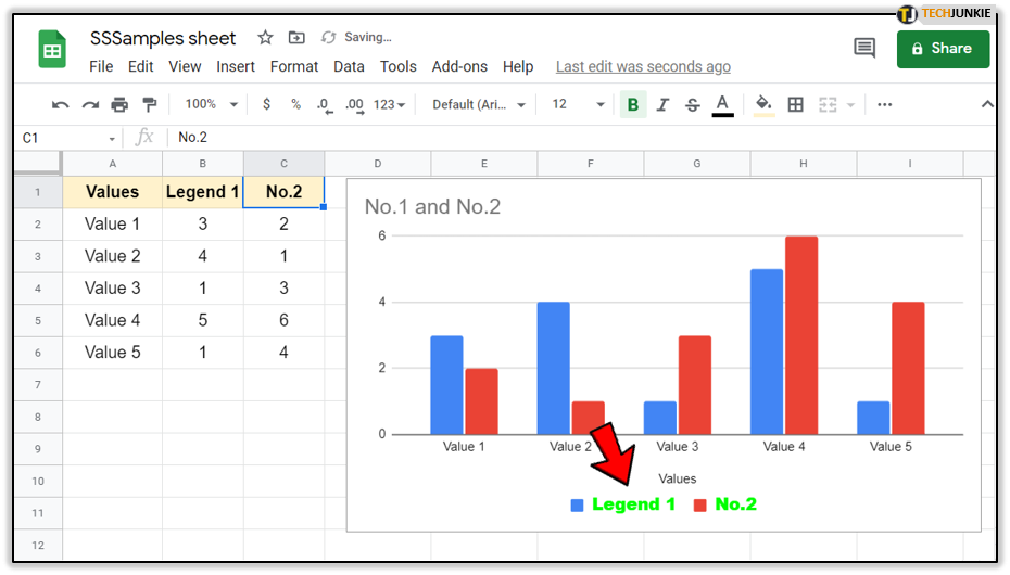
The header of the chart is the header name. By default, the first line of each column becomes the legend name.
To change this, simply rename the first row of the column.
- Double-click the column cell (or double-tap).

- Enter any name that you want.

- Hit ‘Enter’ (or just tap anywhere else on the screen). This will change the name of the legend, too.
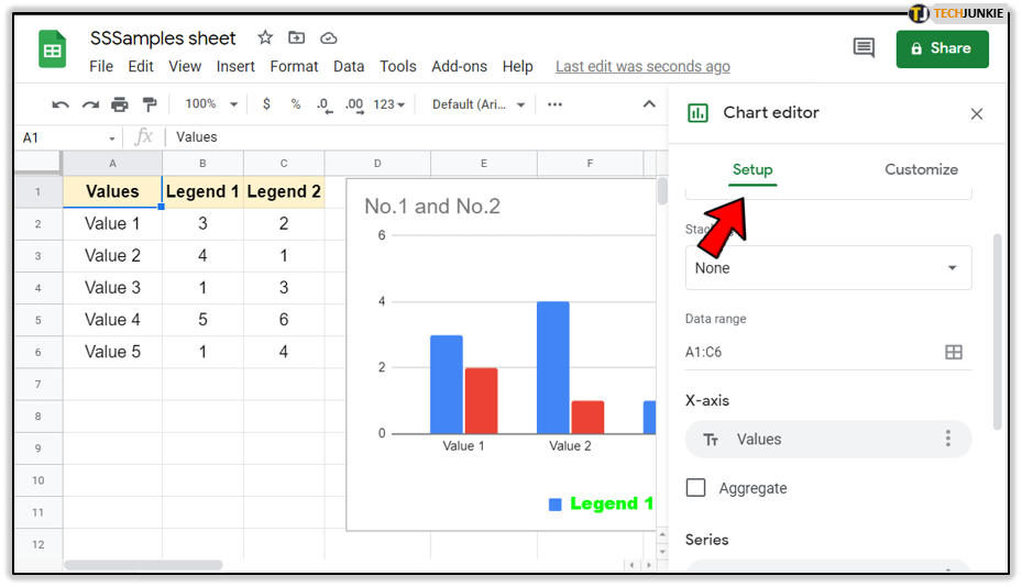
Switching Legend Headers
You don’t have to use the column header as a legend header. Instead, you can switch things up and use the value of the rows. To do so, you should follow these instructions:
- Double-click (or double-tap) your chart.

- Select the ‘Setup’ tab from the box.

- Tick the ‘Switch rows/columns’ option at the bottom of the menu.

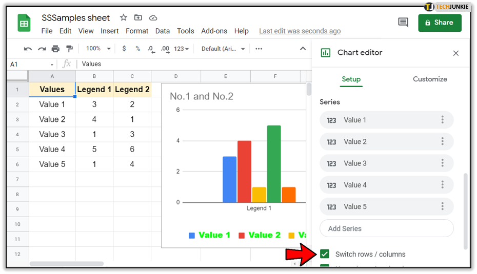
Now the first rows will become headers and the entire structure of your chart will change up.
Since there were plenty of rows in our document, the number of headers is also bigger. You can see that the previous ‘Legend 1’ and ‘Legend 2’ headers are now below the two groups of charts.
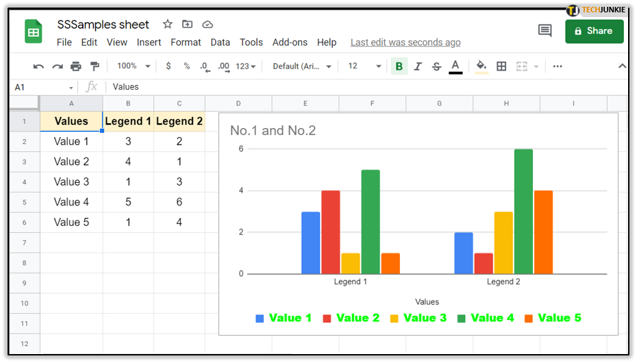
Also, since there are more headers, the customizations that you used in the previous version may not work as well. If you used a larger text size, for example, there’s a chance that the chart window might be too small to display them all.
That’s why you should use the instructions from the previous two sections to customize the font, size, and the color of the legend. In addition, you may change the names of the headers if needed. The only difference is that you change the first cell in each row to change the name of each legend label.
Name Worthy of a Legend
As you can see, naming the legends is a fairly simple task. Even if you (still) can’t change it in the chart setup window, it’s easy to customize it directly from the Google Sheet.
The task, however, can get a bit complicated if you’re working on large documents that have much more than just a few labels. That’s why you need to be attentive with the legend position and font type and size.
How do you cope with the legend in large documents? Which font size and position do you use? Describe your methods in the comments section below.