TechJunkie is a BOX20 Media Company

Home PC Windows The New Icons of OS X Yosemite – A Side-by-Side Comparison

The New Icons of OS X Yosemite – A Side-by-Side Comparison

The New Icons of OS X Yosemite - A Side-by-Side Comparison

Apple is giving its desktop operating system a complete visual overhaul with OS X Yosemite. From widespread use of transparency, to new typography, to cleaner and flatter app design, OS X Yosemite will clearly stand out when it launches this fall.

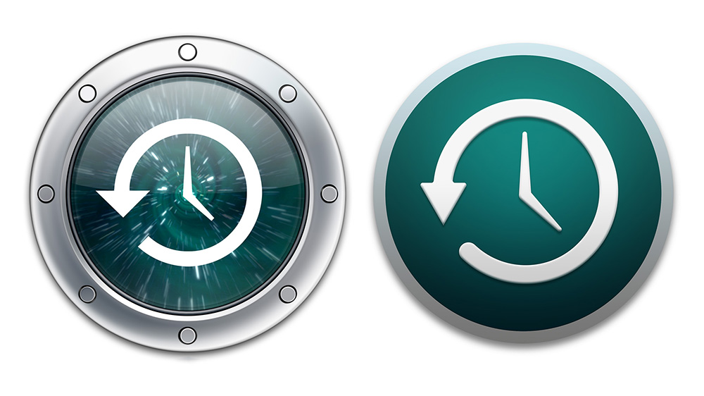
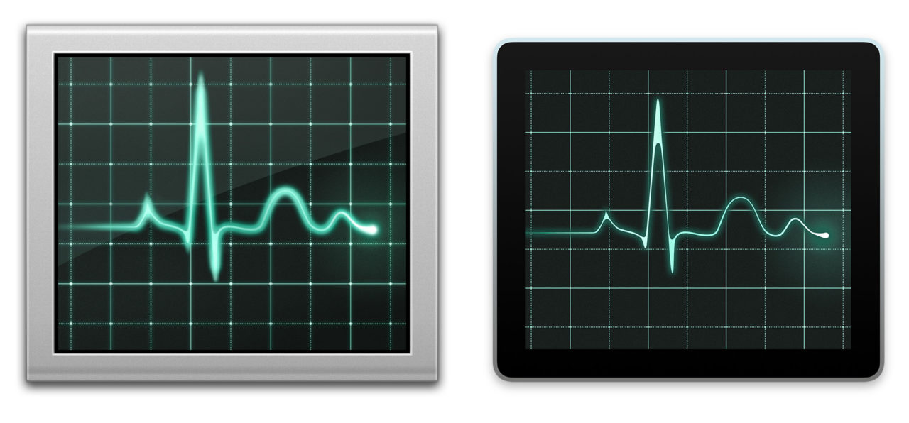
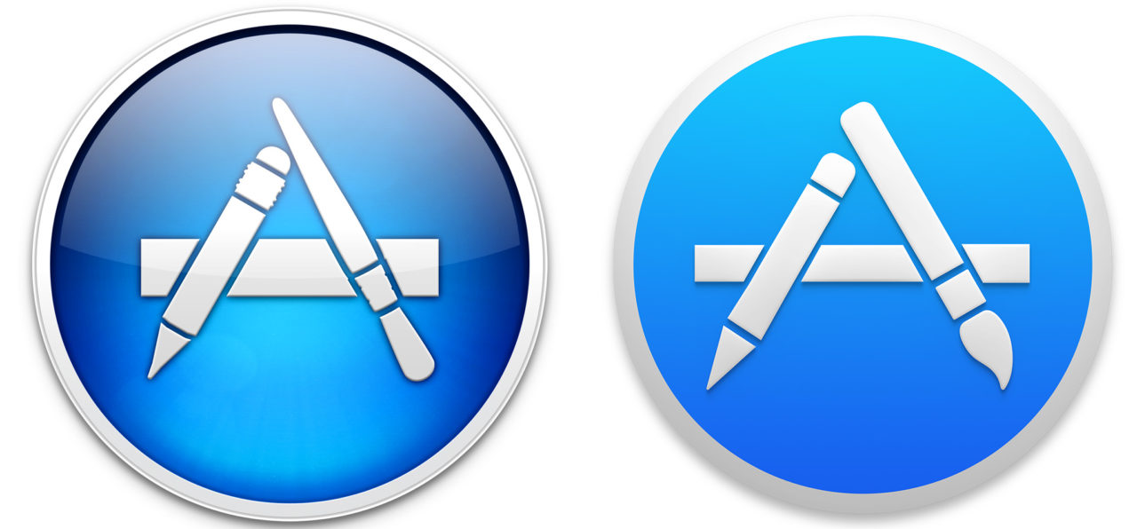
As a preview of what’s to come, here’s a side-by-side comparison of the new application icons, with OS X Mavericks on the left and OS X Yosemite on the right. The icons are proportional to their full size, so any differences in layout or size between Mavericks and Yosemite icons is representative of their actual differences in the UI.

Update: Forgot to add the Trash icons! You can find them at the end of the list. Note that they’re not as high resolution as the others because Apple only provides a standard and 2X “Retina” version for trash compared to much larger 1024×1024 icons for apps.

Update 2: As pointed out in the comments, we forgot Finder, too! It’s now displayed first in the list, and as you can see it’s likely to be one of the more controversial of the new designs.

Update 3: Apple just released the second developer build of OS X Yosemite, and reintroduced Photo Booth with a new design and icon. It’s added first, below.

Photo Booth OS X Yosemite

Finder Mavericks vs Yosemite

activitymonitor appstore calculator calendar contacts dictionary facetime gamecenter ibooks

launchpad

mail

Continued on page 2

Feature Phones With Hotspot Capabilities

Read Next 

30 thoughts on “The New Icons of OS X Yosemite – A Side-by-Side Comparison”

pazi11 says:
Why did Apple change the Finder icon? Its the damn LOGO of Mac OS! You cant change a beautiful logo into something that looks like cheap plastic.
dnewton says:
I have the Finder icon from 10.6 https://www.mediafire.com/?z58xgio3tzx37tt
you have to do some terminal fangling to get it to replace the file in the dock.app but imo it’s worth replacing the crappy flat yosemite/el capitan icon
Pontius Pilate says:
I can’t stand the new look. I came here looking for an old finder icon I can insert in the OS so I don’t have to constantly view the silly replacement. The graphics cards in the mac along with the high def screens make for the best dimensional display ever and yet all the visual luxury is replaced with flattened and uninspired crap.
dnewton says:
I’m not sure if you ever found what you were looking for, but I run on an older version of OSX and have the old finder and trash icons in a zip file. https://www.mediafire.com/?z58xgio3tzx37tt

the pngs go into the dock.app resource folder and the finder.icns into the finder.app resource folder

Pontius Pilate says:
Thanks very much!
dnewton says:
No problem! glad to help haha
Abraham Girt says:
When I just here the word OS X Yosemite, it makes me get angry and mad as a goofball.
Abraham Girt says:
LIKE I SAID, DON’T UPGRADE! Upgrading is not a requirement, it’s a option!
Abraham Girt says:
What happened to poor skeuomorphic? Everyone, you know just don’t upgrade! Apple will get over it someday; they will feel bad for us, and go back to skeuomorphic again. That’s what I hope for!
Abraham Girt says:
The evil Jonny Ive did it all! He created these icons, blame it on him.
Abraham Girt says:
Please dislike these icons!
Abraham Girt says:
Hahaha! You Apple, make these so called cleaner professional iOS-like icons. These icons are by-far extremely ugly!
Rocket Rich says:
I didn’t like any of them at first didn’t even upgrade then started looking at Flat UI now and designing a rockt for http://rocket-rich.com/design-ideas.html … and after using Yosemite… LOOOOOOOOOVE it all The World is FLAT now to me at least :)

Finder Icon is definitely awesome frosted appeal great colour scheme

Abraham Girt says:
Another goofball here!
dis666 says:
The shiny jellybean trend had gotten a bit out of control, with Apple and Microsoft and dozens of other development teams trying to out-shiny each other, but this is definitely too much of an about face for me to stomach. Almost all detail has been suppressed, as if the design staff had a meeting and decided none of the details could be seen clearly, so let’s just blur them out.
dis666 says:
I have heard so much from PC geeks about how awful Windows 8 looks with phone-ish icons. Now we see Apple is becoming Microsoft’s parrot. I noticed the merging of “minds” when Apple started dropping their terminology that distinguished them as not PC, such as “Desktop Background” instead of “Desktop Picture” and “Wi-Fi” in Network instead of AirPort.
dis666 says:
Most of these depict dumbed-down, childish, reduced depth, flat, cheap-looking, like Windows or worse. I feel like my system has been flashed back to 1989, but with better color brilliance. It looks like Hasbro was hired to design the icons. Obviously this is an attempt to move in the direction of making Mac OS look like iOS. It’s frightening, because it purports of a time in the near future when Macs will be all touch screen tablets, really just larger versions of iPad. I prefer to look straight ahead while resting my typing hands on the desk, not typing on the screen.
The Original Nerv says:
The new Finder icon looks like it was developed by someone who previously worked on Windows design. Ugh!
Greg Ferguson says:
In EVERY case shown here, the “upgrade” destroyed any aesthetic value. Half the time I cannot find anything I am looking for – blobs of garbage instead of icons don’t impress me. What’s next – full screen charm apps? Apple seems intent on helping Microsoft reclaim market share – so many escaped the disgusting mess of Windows H8 to Apple that I guess Ives must feel bad and has decided to also ruin Apple’s O/S to help them go back. iOS 7 and iOS 8 are horrible to look at – so bad in fact, that I switched to Android just to get away from them. Now I feel like switching away from OSX – it’s putrid.
Alexis Eduardo Morales Flores says:
Good, i like it.
johnTnash says:
Generally speaking, I’m not a fan, but I can live with it. The biggest fail of the bunch, IMO, is the trash icon. Neither flat nor real-world. Just bizarre.
Sushmeit Madhavan says:
Honestly though, 3D, 2D, skeomorphism, minimalism, icon conventions and other blah blah apart, the thrash can actually seems to be the direction I imagined that the direction Mac could head towards, when I first saw iOS 7. Apple’s own new way of doing ‘flat’.
Prescott Perez-Fox says:
I miss the old Trash. Everything else is fine being so similar.
itsknotme says:
Sadly, the Mac is trying to be compliant with the ipad and iphone hardware.
Jack Spicer Adams says:
I don’t like them, I much prefer these flat icons by Applove:

http://www.behance.net/gallery/8995421/Free-program-icons

Tim says:
Apple suffers from a lack of consistency. When designing icons for an OS that has as many different ones as the Mac, there needs to be visual links between all of the icons as well as between groups of similar icons. For example, all Utilities should use the same color, shape and style. That will immediately tell people what Kind of app it is, then the icon will describe the app itself.
Why is Safari a round icon, but Mail is still a stamp? Why are some simple icons and others still skeuomorphic? They really need to just hire a company like IconFactory to redesign everything for them.
Martin says:
Copy that. A complete lack of consistency throughout the logo design. Just a wild mix of 3D and flat icons.
Ivo Gregurec says:
The pen on the new TextEdit icon is most skeuomorphic object that ever came out of Apple :)
Ivo Gregurec says:
The last Mac Pro looks like a trash can and the Trash can looks like a glass of milk… How would suppose to look a glass of milk then?
Kosame707 says:
Seems like a half-hearted attempt at a flat style. The amount of detail varies from one to another and looks inconsistent on the whole. The pallet is also somewhat of a mess. I should think that an update of all system icons – if indeed that is their intention – has to be bolder, unafraid and representative of the new appearance of the next OS. If not, don’t bother changing it.
Ericca says:
These icons are inconsistent. Some are flat, others are semi flat, and others are 3 dimensional like the trash, notepad, and preview icons. There should be a consistent style to them all. Games is the most improved and Finder is just awful!!!
Ivo Gregurec says:
Inconsistent, amateurish and regressive. Dock was flat until Leopard – next logical step would be integrated LEAP motion and 3D display for full 3d experience, not vista glass and linux like icons… Btw. I expected OS XI :)
Cyril says:
Trash icon is unacceptable, others looks fine anyway.
amnesia says:
Disgusting icons. Inconsistent design/styles, skeuomorphism… They need to fire the people who made this, ASAP. And what’s with the Mail.app icon? A postage stamp? Seriously? IT’S 2014, GOOD MORNING!
Mike Morkes says:
I wish these had been saved as PNGs with the background knocked, rather than flattened JPEGs. I wouldn’t mind building some usable icons. :(
Ericka Seastrand says:
I don’t mind most of these, which probably puts me into a minority, but the Finder icon is kind of ridiculous. Inconsistent rounded corners and inconsistent line weight sharpness. It’s actually a bit reminiscent of Mac circa late 90’s instead of being this flat design they’re striving for.
Daniel Cheung says:
I don’t like the drop shadow in the middle of the Finder face, I think it made it look unpolished and unprofessional. Without the drop shadow, the face would look textured like the spots on a cow and have a beautiful seam.
lgsoltek says:
You forget the iTunes icon too.
rubenrojas says:
The itunes icon in yosemite DP 1 have no changes

Leave a Reply

Your email address will not be published. Required fields are marked *


Jim Tanous

Jun 3, 2014

676 Articles Published

More